
Redesigning the Favor Customer App
A design project for Favor Delivery • 2016 - 2021
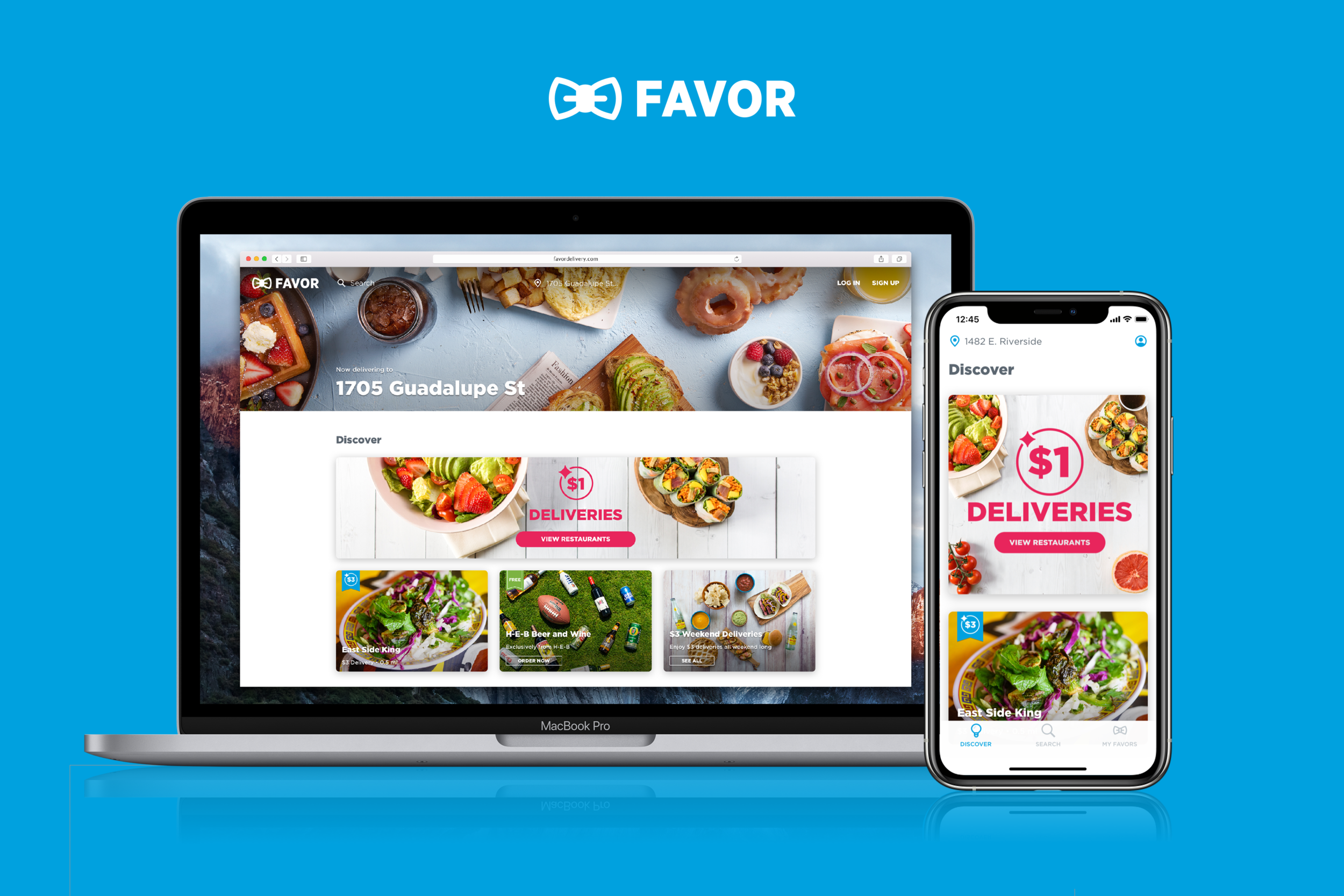
Favor’s customer app was the gateway through which users could browse for merchants in their area, build and place their orders, and then track the progress of those orders. Over the course of several years, I made many design improvements that elevated the quality of Favor’s brand and customer app experiences, and ultimately resulted in a completed redesigned customer app for both mobile and desktop devices. This case study will detail some of my most significant customer app design contributions.
Table of contents:
I. Restructuring the app’s information architecture
II. Creating a ‘screen licking good’ experience
I. Restructuring the App’s Information Architecture
One of the first things that needed to be improved in the customer app was its information architecture. For context, here’s what the app looked like when I started at Favor in 2016:
Fig. 1
Fig. 2
Fig. 3
Fig. 1: “Spotlight” was the primary landing screen of the app, and contained a list of featured merchants and discounts.
Fig. 2: “Discover” was another top-level section of the app that allowed users to browse merchants by category.
Fig. 3: The “Order Anything” button (as seen in Fig. 1 and Fig. 2) was the entry point to searching for merchants and browsing merchant menus. In this example, a user has navigated to the Order Anything screen, searched for “Veracruz All Natural Tacos,” and is now looking at the Veracruz menu.
By looking at mostly qualitative user feedback, I was able to identify a few problems with the original structure of the customer app:
People didn’t understand the difference between Spotlight and Discover. These two sections contained very similar content - lists of merchants - and felt like they could be consolidated.
The user’s current location wasn’t visible. The current location was critical to displaying relevant content to customers, and there wasn’t anything on the screen that made the current location obvious. Users didn’t understand how to change or modify this.
The Order Anything button didn’t provide a clear access point for search. During user testing, I actually found that some users thought the Order Anything button would order something random as soon as they tapped on it.
To solve these problems, I made the following changes:
I combined Spotlight and Discover. Consolidating Spotlight and Discover into a single Discover feed eliminated the redundancy and confusion of the two sections.
I made the current location visible. The user’s current location would display in the app’s header bar, and tapping on the location title would allow the user to change their location.
I removed the Order Anything button, and made Search a primary destination via a new tab bar at the bottom of the screen. This was much clearer for users, and a better match for their pre-existing mental models.
Fig. 4
The information architecture updates were positively received by customers, and greatly streamlined the app by making browsing, search, and location information much clearer. They also set the stage for updating the app’s look and feel, and for redesigning search and merchant menus.
II. Creating a ‘Screen Licking Good’ Experience
I distinctly remember having a conversation early on with Favor’s CEO where he said “Our app should make customers want to lick their screens.” Hilarious if you picture that statement literally, but the point was to create an experience that would get people excited about ordering food. Fortunately, one of Favor’s biggest assets was its photography. The customer app’s original user interface didn’t do a great job at effectively highlighting merchant imagery - most pictures were dimmed, and the title text for merchants sat directly on top of the images, taking the focus away from the photos. After a few UI and visual design changes, I was able to brighten the mood by giving the photography the attention it deserved.
Here’s what the app looked like after the redesign:
Fig. 5
Fig. 6
Fig. 7
Fig. 5: An interaction showing the new Discover feed. I created a card-based UI that put the photography front and center, and gave the app more breathing room. Other improvements included showing the distance and the delivery price for each merchant. I also worked with the marketing team to design a new discount badging system and a fun new splash screen animation that played while the app was launching.
Fig. 6: A list of merchant categories that could be accessed from the new discover feed. I used a different form factor for category cards so they would be visually differentiated from merchant cards. I also worked closely with the creative team to ensure that the photography for each category card would display well.
Fig. 7: A list of merchants inside the Juice & Smoothies category.
The result of these changes was an app that felt light, cheerful, and vibrant. The new merchant presentation put an emphasis on Favor’s great photography, and gave the app new life. Customers responded to the update by saying they perceived Favor as being friendly and fun.
III. Desktop Web Ordering
In addition to refreshing the look and feel of Favor’s mobile app, I was also tasked with designing a great desktop web ordering experience. I wanted to create a design system that was consistent cross-platform, and my goal was to translate the updated mobile designs to a larger form factor. On the desktop, I was able to make Favor’s photography stand out even more, due to greater screen real estate. The result was something that I felt was very attractive and different from many of our competitors at the time.
Fig. 8: The Discover interface on Favor’s desktop website. We took new header photography specifically for this layout in an effort to make it even more appealing.
Fig. 9: A view of the Discover feed scrolled down a bit. I gave categories a slightly different presentation to make use of the additional real estate.
Fig. 10: The Juice and Smoothies category. Each category had a unique header image. The photography here was really fantastic.
IV. Decoupling Search from Merchant Menus
The original search interface was very tightly integrated with merchant menus, and resulted in some quirky UI behaviors. When a merchant was selected from search results, the search interface would morph into the interface for browsing a merchant menu and adding items. You can see the original search/menu flow in the following images:
Fig. 11
Fig. 12
Fig. 13
Fig 11: A user has arrived at an empty search interface by tapping the Order Anything button. The search field is active by default.
Fig. 12: The user has started a search query by typing the letters “Ch,” and search results have populated beneath the search field.
Fig. 13: After selecting “Chipotle” from search results, the search interface has now turned into the interface for browsing Chipotle’s menu. Tapping the ‘x’ next to “Chipotle” would exit the menu and return to a blank search, clearing any items that had been added to an order in the process.
My biggest goal with redesigning search was to decouple the action of searching from the action of browsing merchant menus. This would bring more focus to each activity, and allow for a much smaller margin of error during order creation. It would also promote more scalable UI’s, since both search and merchant menus would have their own dedicated screens in the app. The following images show my redesigned search interface:
Fig. 14
Fig. 15
Fig. 16
Fig. 14: The updated search landing screen. From here, a user can begin a new search or browse categories.
Fig. 15: The customer has started a search by entering “Piz,” and search results have populated below the field based on the search query. The current location shows under the search field to help the user understand the context of the search results. Each merchant now displays distance and location information as well.
Fig. 16: This screen shows the entry point to writing a custom Favor. Tapping on “Order from ‘piz’” would navigate to an interface where the user could write an order for anything they wanted (‘piz’ would be the assumed name of the merchant for the order). This was a big part of Favor’s company philosophy in the early days - a service where users could “Order Anything.”
V. Better Location Management
Location information was critical to displaying relevant content in the app, and to ultimately providing a great customer experience. In the original app designs, it wasn’t clear what a user’s current location was or how they could modify it. As a result, I spearheaded a project to make location information within the customer app much more manageable and accessible.
One of the first location-related features that I designed was a first-time user experience that asked for the user’s location. When a customer signed in to Favor for the first time, they would be asked for their current location before moving to the Discover feed.
Fig. 17
Fig. 18
Fig. 19
I also designed a reusable address management interface, where users could quickly switch between saved addresses, edit existing addresses, and add new addresses. The address management interface could be accessed from multiple places in the app, including the Discover feed, a customer’s profile/settings, search, and order checkout. Addresses also gained a few new helpful properties, including “Building Type,” and “Building Name,” which made locations much easier for Runners to find.
Fig. 20
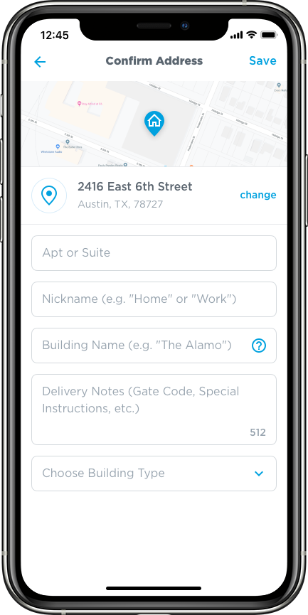
Fig. 21
Fig. 22
VI. Improving Merchant Menus
Favor’s original menu interface was essentially a glorified notepad. All menu items were nothing more than text string templates that could be edited to say literally anything. The system benefitted from the fact that it was very fast to create and customize orders; however, the lack of structure caused many problems when orders were received by both merchants and Runners. My main goal with redesigning menus was to find a way to keep the speed and customization of creating an order, but also provide more structure. Another tangential goal was to design a more attractive menu experience that was visually in line with the rest of the app.
On mobile, I spent a lot of time designing and prototyping a unique cart interaction that made browsing, adding, and editing items feel like a fast and seamless experience. When items were added to an order, the most recent item added would show in the “Your Items” card at the bottom of the screen. The card could be tapped or dragged upwards to reveal the full list of items. Items could then be edited or removed. I did quite a bit of trial and error on this interface to get it feeling right. User testing proved that it was a fast and easy way for customers to build and place orders.
Fig. 23
Fig. 25
On Favor’s desktop website, the menu experience was a little different. I thought it would be advantageous for users to see both the cart and the menu at the same time, so I designed a drawer interface that enabled users to simultaneously browse the menu while also managing items in their carts. The drawer was closed by default, but would open when an item was added to an order.
Fig. 26: The menu for Juiceland. No items have been added, and the drawer is closed by default.
Fig. 27: The user has added two items to their Juiceland order. The drawer is now open, showing the items that have been added.
Conclusion
The customer app design updates I worked on during my time at Favor improved the app dramatically. It received a fresh look and feel that helped elevate the quality of the Favor brand, and a streamlined user experience that made browsing and ordering much easier. The information architecture was more cohesive, search was more accessible, menus were more robust, and location data was much easier to manage. The app generally received great reviews and user feedback, and was seen as a strong consumer brand in Texas. It continues to be improved upon to this day.
While this article details some of my personal work on Favor’s customer app, it was really a team effort. Other design contributors included Nicolai McCrary and Logan Crable for photography, Chris Rogge for branding and creative, Bucky Clarke and Ryan Gray for product design support, and Meg Nidever Neumann for product design and UX support.