
Runner Freedom and Flexibility
A design project for Favor Delivery • 2017 - 2019
One of the main reasons Runners chose to work with Favor was the freedom and flexibility that the job afforded them. Runners could work when they wanted, where they wanted, and for however long they wanted. As a matter of fact, Favor actually had no legal authority to tell Runners when to work, where to work, or how long to work. Runners were classified as independent contractors, which gave Favor very limited authority over a Runner’s time and energy. This created an extremely interesting design challenge: how could Favor maximize Runner productivity, while also not becoming too authoritarian about how Runners performed their jobs?
This article details some of the design initiatives I worked on to improve a Runner’s chances of success with deliveries, while also enabling them to work on their own terms.
Table of contents:
I. Neighborhoods
Balancing supply and demand with a workforce of independent contractors was a tricky problem to solve. Success depended on getting Runners to the right places at the right times, so that all delivery requests could be fulfilled in as timely a manner as possible. In a perfect world, Runners would be strategically positioned to receive the most orders, thus making more money. And customers would receive their orders quickly and in good condition due to efficient Runner positioning.
In the early days of Favor, a market consisted of a single giant area within which Runners would receive orders. We called these large market areas “zones,” and the original zone in Austin might have looked something like this:
Fig. 1: For the sake of illustrative simplicity, this graphic assumes a zone shaped like a circle.
The zone model worked well when Favor’s market areas were still relatively small and manageable; however, it began to break down as Favor’s markets scaled. A couple of problems emerged from a combination of both qualitative Runner feedback as well as quantitative data from Favor’s business analytics team:
Runners weren’t able to choose where they wanted to run within the zone, and often wanted to stay within specific areas of a market. For example, some Runners wanted to stay in more suburban areas because they were more relaxed and easier to manage, and other Runners wanted to stay in more urban areas because they were likely to make more money due to higher demand and higher tips.
As zone areas grew, Runner positioning became much more inefficient, and Favor had no way of directing Runners to specific parts of a market. Runners would often find themselves idling for long periods of time, because they were sitting in locations that didn’t have much activity.
To expand on the second problem a bit, here’s an example of a fairly common scenario that happened with Runner positioning as zone sizes grew:
Fig. 2: In this example, Runners on the fringes of the market sit idle, and have no way of being prompted to move to more active locations.
Favor’s inability to move idle Runners to areas of higher demand led to the business spending a lot of money on “top-ups.” The top up system worked like this: Favor would guarantee that a Runner would make anywhere between $9-$11 an hour, and if that Runner didn’t make the guaranteed amount, then Favor would pay the difference out of pocket. For example, if a Runner was guaranteed $11 and they only made $8 in an hour from deliveries, then Favor would top them up by paying them another $3. This was very expensive for the business, and the desire was to reduce top-up expenses by reducing the number of idle Runners in a market at any given time.
In an effort to make Runner positioning more efficient and give Runners more control over where they worked, I designed a better way for Favor to structure its market areas, which was called “Neighborhoods.” Neighborhoods replaced the single zone concept by creating a series of smaller zones that overlapped each other in places where demand was predicted to be the highest. This new model gave Runners much more freedom and flexibility to choose where they wanted to run, and it gave Favor the ability to incentivize Runners to move to areas where they would be the most productive.
Fig. 4: Neighborhoods were essentially a series of smaller, overlapping zones.
With the neighborhood model in place, Runners needed a practical way to choose which neighborhoods to run in. I designed a neighborhood selection interface in the Runner app, which was the first thing that Runners would see when beginning a work day. It allowed them to cycle through all of the available neighborhoods in a market, as well as view some additional information about those neighborhoods, such as which neighborhoods had higher demand (indicated by a flame icon next to the neighborhood title).
Fig. 5
Fig. 6
Fig. 7
Fig. 5: The interface for selecting a neighborhood.
Fig. 6: A ‘locked’ neighborhood. Neighborhoods were usually locked due to poor market conditions or a supply surplus (too many Runners) in a particular area.
Fig. 7: A ‘slow’ neighborhood. The idea here was that if a Runner selected a neighborhood that didn’t have a lot of demand, we could nudge the Runner to potentially choosing a more active location.
After a Runner confirmed their neighborhood selection, they were presented with a series of “hotspots” - locations on the map that represented the most likely areas to receive Favors. Hotspots were dynamically generated from historical delivery data, and weren’t necessarily representative of what was happening in a market in real time. Hotspots were successful in getting Runners to move to areas of higher predicted demand, but the fact that they weren’t real time indications of market activity actually became a point of confusion. I attempted to clarify this in future design iterations.
Fig. 8
Fig. 9
Fig. 10
Thanks to neighborhoods, I was successfully able to reduce both the number of idle Runners in a market, and the amount we were spending on top-ups. Top-ups decreased from over $1 per Favor to $0.13 per Favor, and Runner idle time went from ~18 mins per hour to less than 10 mins per hour. The feedback from Runners was extremely positive - the interface was very intuitive, and they were very happy that they were finally able to choose where they worked.
As Favor continued to scale and add more neighborhoods to markets, Runners needed better ways to view neighborhood activity and determine the best places to run. I did a few more design explorations around making the neighborhood selection interface more informative and incentivizing Runners to work in places where they would have the most chances of success. These concepts were never fully realized in production, but they offered a glimpse at what I was thinking about for future design iterations.
Fig. 11
Fig. 12
Fig. 13
Fig. 11: An exploration for a new neighborhood selection interface. Rather than linearly cycle through neighborhoods in a market, Runners would see a series of pins on a map that corresponded to different areas. The pins contained information about potential bonus payments, areas of high demand, and areas where no Runners were needed.
Fig. 12: A demand graphing tool. In this concept, a user could scrub left and right on a horizontal time slider at the bottom of the screen, which would update the visualization of predicted demand on the map based on the time of day.
Fig. 13: An idea for switching neighborhoods while in the middle of delivering Favors. If a Runner was in a neighborhood that was slow, the Runner app might prompt them to switch to running in a neighborhood where demand was higher.
II. Accepting and Declining Favors
A Runner’s status as an independent contractor meant that it was their responsibility to decide which deliveries to accept. Favor’s algorithm would present a Runner with orders that it thought were beneficial based on a number of factors, but the Runner wasn’t obligated to accept those orders, nor was it always in the Runner’s best interest to accept every order presented. In the early stages of the Runner app’s development, it wasn’t easy for Runners to decline orders. If a Runner wanted to decline a Favor, they needed to contact Favor’s customer support team to manually request that their Favor be reassigned. Manual reassignments became a huge issue for the company, because they required a lot of time and energy from the customer support team, and also prevented customer orders from being accepted quickly. We needed an interface that would give Runners a way to explicitly decline Favors, and that would automate the process of reassignment when an order was declined. Bearing this in mind, I designed a better way for Runners to view incoming orders and take action on those orders, which you can see here:
Fig. 14
Fig. 15
Fig. 16
When a Favor was presented to a Runner, a modal interface appeared that showed some basic information up front - the merchant, the customer, and a map showing the merchant’s location, the customer’s location, and the Runner’s current location. If the Runner wanted to see more details about the order, they could tap “View Order Details,” which would expand the modal to a state with more information about the Favor. In order to dismiss the modal, the Runner was required to either accept or decline the Favor via two buttons at the bottom of the screen.
A big goal of this project was to reduce the time it took for Runners to accept Favors. Lower acceptance times from Runners meant faster deliveries for customers. In an effort to prevent orders from idling too long due to potential Runner indecision, I designed a timer system. When an order was presented to a Runner, a timer would gradually count down to 0, at which point the order would be automatically declined and reassigned to another Runner. I was careful to test the duration of the timer so that Runners felt they had enough time to make an educated decision about whether or not to accept an order.
Fig. 17
Fig. 18
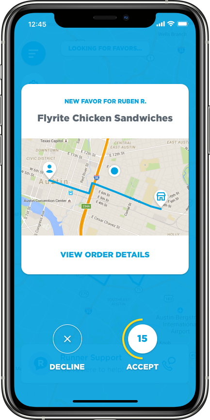
Fig. 19
The timer UI had some interesting design mechanics. Runners had a little more than a minute to decide whether or not to accept a Favor, but the actual timer UI would only become visible in the last 30 seconds. It was displayed as a ring around the accept button that would gradually disappear until the countdown reached 0. At 15 seconds, the timer ring would change to a yellow color to give a sense of urgency.
Since Runners were completely free to choose whether or not to accept orders, another big goal was to incentivize Runners to accept more Favors than they declined. One of the main ways that I did this was by visualizing a Runner’s 30 day acceptance rate decreasing when they declined an order. The acceptance rate statistic was a rolling 30 day percentage that represented a Runner’s average Favor acceptance. If a Runner’s acceptance rate dropped below 70%, they became flagged as a potential bad actor within our system and risked being deactivated. Also, Runners with high acceptance rates were given priority access to scheduling themselves to run at certain times of day.
Fig. 20
Fig. 21
Fig. 22
The new acceptance modal interface was a big success. The average time to accept Favors went down from around 8 mins per Favor to less than 5 minutes per Favor, and the number of manual reassignment customer support tickets dropped from 15-20 an hour to 1-2 an hour. These numbers represented huge wins for customers (since their orders were being accepted by Runners more quickly) as well as our customer support team (since they were spending much less time on order reassignments). Runners were also extremely happy that they could easily choose which Favors to accept or decline.
III. Scheduling
Runners were able to choose when they worked in one of two ways: they could log in to the Runner app at any time and run on demand, or they could use a scheduling tool to reserve times that they wanted to run in the future. The scheduling system gave Runners more freedom and flexibility to work when they wanted, and it also helped Favor ensure that the supply of Runners would meet predicted demand for specific times and days. Since Favor had historical data about which parts of a market would bring the most orders at specific points in time, it was able to use the schedule to incentivize Runners to work at the times and places where they would be needed the most.
The biggest benefit that the schedule offered to Runners was an earnings guarantee - a specific amount of money that was guaranteed for every scheduled hour that they ran. These guarantees were usually in the realm of $9 - $11 an hour. This is where top-ups came into play - if a Runner made less than the guarantee for a scheduled hour, Favor would pay them the difference out of pocket.
Here’s a look at my schedule designs in the Runner app…I’ll explain these in more detail below.
Fig. 23
Fig. 24
Fig. 25
The interface for scheduling was fairly complex. It needed to represent several important pieces of information in a small form factor; namely, the current scheduling availability of specific times in specific neighborhoods, times that had higher demand than others, and times that had bonus amounts attached to them.
Here’s a breakdown of the main screen of the scheduling interface:
Fig. 26
In order to help Runners assess hourly availability at a glance, I created a visual design system for time blocks within neighborhoods. A time block represented specific hours of the day to work - 7AM - 11AM was breakfast/brunch hours, 11AM - 2PM was lunch, 2PM - 5PM was early afternoon/evening, 5PM - 9PM was the dinner rush, and 9PM to 3AM was the late shift. A time block’s background could change between 3 primary states:
A filled blue background that represented that all hours in that block were currently available
A dotted blue border that represented that all hours in that block were currently for ‘on-call’ only
A grey hashed background that represented that all hours in the block were currently claimed by other Runners and were unavailable for scheduling.
Additionally, blocks could have badges attached to them that represented different properties. Only one badge could be attached to a time block at a time. We user tested all of these visual design treatments with Runners to make sure that they were able to understand what was happening. We also implemented a first time user experience to explain how the system worked.
Here’s a more detailed breakdown of the visual design legend for time block cell and badge types:
Fig. 27
When a Runner tapped on a time block, they would drill into a more detailed view for claiming the hours they wanted to run. It’s worth noting that “On Call” was a special state where a Runner was essentially put on a waiting list for that hour, since other Runners had already claimed all availability. If any of the other Runners who had already claimed that hour dropped out, then the on-call Runner would be given the chance to reserve the hour. The on-call system was something that existed before I started working on this project.
Fig. 28
Fig. 29
Fig. 30
Fig. 28: The hours view for the Central Austin neighborhood. The Runner can scroll through all hours of the day and schedule themselves to run at the hours of their choosing, assuming those hours are available. In this example, no hours have been claimed.
Fig. 29: The hours from 7AM to 8AM and from 1PM to 2PM have been successfully claimed by the Runner. The Runner has also opted to go on call for the hour slots from 9AM to 10AM and from 10AM to 11AM.
Fig. 30: The two hour slots that the Runner went on call for have now become available due to other Runners opting out.
IV. Conclusion
A Runner’s freedom of choice - where to work, when to work, and which Favors to accept - was certainly one of the more interesting elements of the delivery ecosystem. It made things challenging from a supply/demand perspective, because our team was constantly trying to figure out how to get Runners to the right places at the right times, and how to incentivize behavior that was in everyone’s best interests. The projects detailed here - Neighborhoods, the Acceptance Modal, and the Scheduling tool - were all efforts to balance supply with demand, to maximize Runner efficiency, and to give Runners more freedom and flexibility to work on their own terms. I believe that we were able to successfully accomplish these goals, although we were always looking for ways to improve. In retrospect, these were some very tricky logistical problems, and I very much enjoyed working on them.
While this article details some of my personal design work for Runners, I also want to give a quick shout out to a couple other design contributors who were along for the ride at different points in time - thanks to Bucky Clarke for product design support, and to Meg Nidever Neumann for product design and UX support.