
Presentation Mode
A design project for Evernote • 2014 - 2015
Presentation Mode is a feature within Evernote that displays notes full screen and nicely formats them for a presentation style viewing experience. In addition to formatting a note's content, presentation mode identifies key break points in a note and automatically creates sections of content that act like slides; however, there are no 'slides' in Presentation Mode - all content is presented in a continuous vertically scrolling format, and the user is able to use the spacebar to quickly hop from one key break point to another. When I was tasked with designing Presentation Mode for Windows, I was responsible for taking existing Mac designs and improving upon them. I made changes to the UI, UX, and visual design of Presentation Mode that ultimately resulted in a better experience than what the Mac version was offering at the time.
V1 Designs
Presentation Mode went through a couple different iterations while I was at Evernote. The designs here show the first version I worked on for Windows. At a glance, it might be a little tricky to understand what's going on, but hopefully the comments will help explain things in detail.
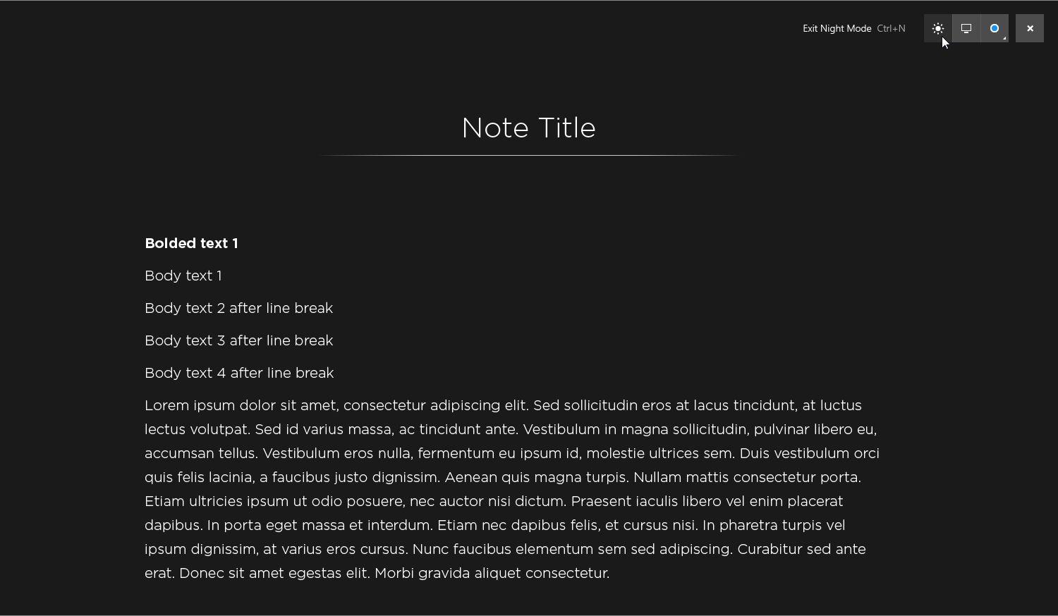
This image shows a note being presented, right after Presentation mode has been activated. When Presentation Mode is launched, the main UI controls are shown at the top right - they contain a button to activate night mode, a button to change monitors (this would only show if more than 1 monitor is present), a button to change the cursor style, and a button to exit Presentation Mode. Buttons to navigate to the previous or next notes in the user's notebook are on the left and right edges of the screen, and a button to jump to the next key break point in the note content is at the bottom edge of the screen. All of these controls are initially visible on launch and fade out after around 4 seconds.
Most of the UI controls have tooltips associated with them, and these tooltips only show on mouse over. This mockup shows the tooltip for the cursor button, and the resulting submenu that appears when clicking the cursor button.
This is a breakdown of different button states and their tooltips:
Clicking an image in Presentation Mode launches into a specialized viewing mode, where all other content is stripped away and zoom and pan controls become available. In the Mac version of Presentation Mode, people had no idea that they could enter this viewing mode, since there weren't any clues for them to do so. In the Windows version, we gave images a clear call to action that appeared on hover. This was a small change, but big improvement.
Similar to images, videos were given a hover state to indicate that a video could be played.
Although this was never implemented, I wanted to enable videos to play inline inside of presentation mode.
Presentation Mode replaces the default system cursor with a digital laser pointer. The laser pointer was meant to mimic a real life laser pointer with a trail. In this mockup, I was trying to see what the tail of the laser pointer would look like in different situations.
The night mode button acts as a toggle to enter and exit night mode. Activating night mode changes the Presentation Mode color palette to a darker version of itself.
In this mockup, an image has been clicked and the image viewer has been activated. The user has controls to zoom and pan, and can navigate between different images in the note.
Zooming in on an image in the image viewer shows a tooltip that contains the current zoom level and a tip on how to pan the image.
Mousing to the middle left or right edges of the image viewer would reveal buttons to go to the previous and next images in the note (assuming there's more than one image in the note).
The image viewer was also designed to open and view PDF's, although this functionality was never implemented on Windows.
Prototypes
Since Presentation Mode has a pretty dynamic interface, I spent a good bit of time prototyping different interface behaviors. UI controls had subtle fade-in/fade-out animations, tooltips appeared on hover, and certain buttons would slide in and out as needed. A lot of the design challenges revolved around when to show different UI elements, and how long they should remain visible - I user tested most of the interactions to figure out the best experience. Take a look at some of my early stage interactive prototypes for presentation mode, and see what you think.
1. Presentation Mode UI Interactions
This prototype details how the main UI of Presentation Mode behaves. It shows how buttons fade in/fade out, how tooltips appear/disappear, and gives a general sense for the feel of everything. It also has a working nightmode button.
2. Document Viewer v1
I took a couple stabs at prototyping document viewer interactions...the first document viewer prototype I put together felt a little heavy with the UI. It had previous and next image navigation buttons on the left and right edges of the screen, a thumbnail drawer (which later got nixed), and fully functional zoom and pan operations.
3. Document Viewer v2
The second document viewer prototype I created got rid of the thumbnail drawer and made some small changes to the previous and next image buttons. I also made it so the previous and next image buttons actually load new images when they are clicked!
V1 Specifications
Here are some of the specs I drew up for the engineers to reference for the first version of Presentation Mode on Windows:
V2 Designs
The second version of Presentation Mode saw the visual design of the UI change a bit, as well as the addition of a new tool called the "layout editor." The layout editor would allow a user to manually place break points in their documents, so they could better arrange how they wanted their content to flow in Presentation Mode. I didn't design the layout editor itself, but I did design a new access point to get to the layout editor. Once again, I was kind of trailing behind what the Mac version was doing and trying to improve upon the Mac.
Check out this prototype I put together for a quick overview of Presentation Mode 2.0:
You can see that the visual styling for both the note content and the UI elements changed a good bit. The icons were lifted from the Mac version.
A small interaction design change for Windows was to show the cursors submenu on mouseover instead of on click.
Previous and next note navigation controls were removed in the second version of Presentation Mode - we found that they didn't provide much value in the first version. Since the navigation controls no longer took up real estate at either of the screen's middle edges, I decided to put the layout editor button on the middle of the screen's right edge.
The layout editor expanded: